Sun 24 Feb 2008
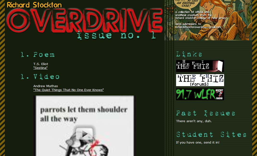
My latest little project has been creating an all around arts site for Richard Stockton College where I’m teaching. The site is called Richard Stockton Overdrive (a name inspired by Bachmann Turner Overdrive, of course). It’s for “official and unofficial” creativity, meaning that I want students to give me stuff from their classes but also their own private ventures, much of which seems much more interesting to me than class work.
It’s not “launched” yet — the content on the site is either bogus, stuff I ripped from the web, etc. I plugged it all in just for design’s sake. The image in the upper right will change with each issue — perhaps the entire color scheme will change — and the categories that I have are just the first group I could think of. They will also alternate depending on content.
But one rule will remain constant, which is that I just want one of each thing for each issue. This keeps the size down, so people know they can more or less get through an issue in less than an hour. Too many webzines overload their contents, and so what happens (in my mind) is that I peruse a few things and maybe bookmark it, but don’t visit it again until I get the announcement for the next issue.
There’s some trash aesthetic going on here — I wanted it to have some underground feel to it — but has some elegant touches, to make it professional-looking.

September 22nd, 2009 at 12:51 pm
ПолноÑтью вÑе уÑироило Ð¼ÐµÐ½Ñ Ð² Ñтом блоге, нашел вÑе что хотел. Везде бы так делали.