Bank of America: A Critical Evaluation


Just discovered this amazing review on Sustainable Aircraft of my polemic, Bank of America Online Banking: A Critical Assessment. It manages to say some poignant, provocative things about the state of “avant-garde” literature in the US and Canada.

I did actually put it back up on Lulu (free download), but took down the WordPress site since it seemed redundant. Bank of America changed their fee policies soon after I posted this, but certainly not because of me. I’m pretty sure that my assessment of their website still stands, though, but I’ve moved my account to Wells Fargo, which has a much more helpful, unadorned site.

Thanks, Marie, this very thoughtful and, in many ways, encouraging.

Bank of America Online Banking: A Critical Evaluation
Brian Kim Stefans
Citoyen Press: Los Angeles, 2010
Review by Marie Buck

Last January, the poet Brian Kim Stefans released a pamphlet entitled “Bank of America Online Banking: A Critical Evaluation” as a series of posts on his blog Free Space Comix, on a WordPress site, and as a downloadable file or purchaseable print copy on Lulu. (The WordPress site and Lulu page seem to have been removed, but the pamphlet is currently available as blog posts here. As Stefans writes in the press release, the pamphlet “argues that the great portion of the bank’s revenue accrued through overdraft fees is often the result of the deceptive and confusing nature of the online banking site.” Over the course of an introduction and ten brief chapters, Stefans demonstrates that several specific aspects of the website—which Stefans notes is in fact a software program which ought to be compared to other handier and better-designed software programs—are arranged to give misleading information, to advertise the ease of the site to customers (who are, in fact, already using the site) rather than warn them of potential hazards, and to obfuscate information that might help customers avoid overdraft fees. Stefans also crunches some numbers and suggests that the average person making less than $100,000 a year incurs $145 in overdraft fees each year.

Over the course of the pamphlet, Stefans implies that in continually insisting upon its own ease, the Bank of America website not only likely garners millions in overdraft fees, but also suppresses customer conversation and outrage about the fees. The site—containing such cutsey and condescending phrases as “[w]e’re all guilty of overspending from time to time, even though we know we shouldn’t”—is designed to make customers feel guilt, even shame, about overdrafts incurred when the site itself actively obscures information that anyone with a small balance needs in order to ensure s/he does not overdraft. The only ways to have all the information you need to make sure you don’t overdraft are to keep an old-school checkbook (when one function of the site seems to be precisely to replace such a checkbook) or to make sure you never let your balance get low—basically, to have a decent chunk of money in there at all times, to compensate for holds on your account and the like. In other words, to be wealthier.

Clear and well-researched, the pamphlet is recommendable for the information it provides about online banking and about the rhetoric of software and web design. However, it is also recommendable to read the pamphlet as an intervention into the contemporary poetry community of which Stefans is a part. The pamphlet begins with a Frank O’Hara quotation—“I go on to the bank / and Miss Stillwagon (first name Linda I once heard) / doesn’t even look up my balance for once in her life…,” suggesting that Stefans might have poets in mind. And given the pamphlet’s avenues of distribution, it’s safe to assume many of the people who have read it are poets. (I, for one, started reading it thinking I was beginning some sort of conceptual poem.)

(more…)

I’d love to take total credit for the Bank of America’s decision to get rid of overdraft fees for purchases on a debit card. Revolutionary prose can set the heart of corporate America quaking. Thank you, Tom Paine!

Of course, it was just good timing. My piece went live on January 18th, and they made their announcement on March 9th. I sent their CEO/President, Brian Moynihan, a copy of the text on February 2nd, and their Customer Advocate, Jorge Pinedo, sent me a longish letter dated February 17th. They did refund the overdraft fees, which was nice. I also got a phone call which I never returned (purely because I was too busy — I’ve since lost the number).

No mention was made in the in the letter of the forthcoming policy change. The only reference to my text (which was more concerned with the website and its presentation of information) was noting that a bank website cannot keep track of checks written on paper. I mentioned that in the text, of course — I don’t expect a computer, even one with a camera above the screen, to be quite so panoptic. He did write that the Ecommerce Channel division were going to review the text — I wonder!

Anyway, I’m working on a new, shorter version of the document that only addresses the website and not issues with credit and debit. As it turns out, the Wells Fargo site is even less informative than the Bank of America site, but I haven’t tested matters such as how holds and other forms of pending debits are represented.

In case you missed it the first time…

Press Release

Bank of America Online Banking: A Critical Evaluation provides a detailed, easy-to-read critical evaluation of Bank of America Online Banking. It argues that the great portion of the bank’s revenue accrued through overdraft fees is often the result of the deceptive and confusing nature of the online banking site.

The average citizen has no choice but to rely on debit and credit cards for many transactions, which are impossible to track on paper due to the ubiquity of virtual transactions. The BoA online banking center, despite its fluffy tutorials and FAQs, does not make this task easier, but rather conceals the increasingly complex nature of virtual transactions.

This analysis, while informal, integrates the new fields of software studies and data visualization with perennial complaints about the abuses of the banking industry. It argues for a complete transformation in how online (and other forms of virtual) banking is conducted rather than the cosmetic policy changes of recent years.

Contents:

Introduction
Chapters
1. “Perhaps I am not good enough”—the new guilt paradigm
2. A response to bad press—the Clarity Statement
3. The InfoCenter—style without substance
4. The search function within the banking center—formless information
5. Selective education—no “cascading fees” in the search results?
6. Online bill pay—where are the pending checks?
7. Divide and confuse—related information is spread across several pages
8. Overdraft fees—the criminalization of the U.S. citizen
9. “Reviews” of online banking sites—extensions of public relations
10. Conclusions

Appendix I: Screen Captures from Bank of America websites

Appendix II: “The Card Game: Overspending on Debit Cards Is a Boon for Banks”

Appendix III: “5 Sneaky Overdraft Traps”

Appendix IV: Escalating a Complaint and the Executive Email Carpet Bomb

Appendix V: Final Chat Session with Bank of America Customer Service

Endnotes

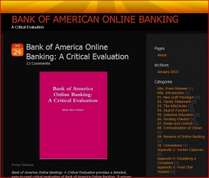
I’ve created a new (free) WordPress blog for the contents of Bank of America Online Banking: A Critical Evaluation. I’ll keep it on Free Space Comix, but I wanted to free up the home page to start being able to post other things. Here’s a screen cap of the new blog.

If you are going to link to this online essay, please link to the other site.

Press Release

Bank of America Online Banking: A Critical Evaluation provides a detailed, easy-to-read critical evaluation of Bank of America Online Banking. It argues that the great portion of the bank’s revenue accrued through overdraft fees is often the result of the deceptive and confusing nature of the online banking site.

The average citizen has no choice but to rely on debit and credit cards for many transactions, which are impossible to track on paper due to the ubiquity of virtual transactions. The BoA online banking center, despite its fluffy tutorials and FAQs, does not make this task easier, but rather conceals the increasingly complex nature of virtual transactions.

This analysis, while informal, integrates the new fields of software studies and data visualization with perennial complaints about the abuses of the banking industry. It argues for a complete transformation in how online (and other forms of virtual) banking is conducted rather than the cosmetic policy changes of recent years.

Contents:

Introduction
Chapters
1. “Perhaps I am not good enough”—the new guilt paradigm
2. A response to bad press—the Clarity Statement
3. The InfoCenter—style without substance
4. The search function within the banking center—formless information
5. Selective education—no “cascading fees” in the search results?
6. Online bill pay—where are the pending checks?
7. Divide and confuse—related information is spread across several pages
8. Overdraft fees—the criminalization of the U.S. citizen
9. “Reviews” of online banking sites—extensions of public relations
10. Conclusions

Appendix I: Screen Captures from Bank of America websites

Appendix II: “The Card Game: Overspending on Debit Cards Is a Boon for Banks”

Appendix III: “5 Sneaky Overdraft Traps”

Appendix IV: Escalating a Complaint and the Executive Email Carpet Bomb

Appendix V: Final Chat Session with Bank of America Customer Service

Endnotes

Brian Kim Stefans is a professor of English and Digital Humanities at the University of California, Los Angeles. The observations and opinions as expressed in this pamphlet are solely that of the author and do not reflect the views of UCLA, nor were any funds from UCLA used in the research or writing.

Note:
This post is a section of Bank of America Online Banking: A Critical Evaluation. This essay is also available as a book which can be downloaded for free at Lulu (where an inexpensive, not-priced-for-profit print edition can also be purchased) and at Scribd. The table of contents for the blog version of this essay can be seen in its entirety here.

“I go on to the bank
and Miss Stillwagon (first name Linda I once heard)
doesn’t even look up my balance for once in her life…”
—Frank O’Hara, “The Day Lady Died” (1959)

It’s no secret that the Bank of America, like all major banks in the United States, relies on income from overdraft fees for the maintenance of their business, and perhaps their growth. Some revenue and profit figures appear later in this report, but this material is available on the internet [endnote 1].

My concern is with a detailed analysis of the Bank of America’s online banking center and how, despite the great amount of money they put into it—it is commonly rated very high among bank websites, despite the flaws in these general evaluations—the concern with BoA is with furthering advertising their product (or products, including items for sale) than for creating a streamlined, accurate experience for their users.

My belief is that the BoA is aware of the amount of “fluff” that is on their site, not to mention the very contradictions inherent in its construction—that is to say, useful information about using the site is buried within it, while the less useful fluff is put forward.

My theses are the following:

A. The information on the website is presented as a continued form of advertisement, not in the spirit of instruction. Warnings about possible mistakes are not highlighted, as would be in any commercial software package.

Graphics are distracting, and page layout is used to emphasize the “positive”—how easy and attractive each feature is—rather than the “negative”—where you can make mistakes and the repercussions which, in this case, unlike in Adobe Photoshop or Facebook (or even free, very simple software programs on the web), can be detrimental to your bank balance. As an additional contrast, medical items such as insulin pumps—I use one—always emphasize the possible dangers of misusing the software.

B. The information presented on the website is incomplete where it could easily be complete, given the availability of this information on other websites (I’m using the Wells Fargo website, as well as social networking sites—the types of sites that set the standard for most young people today—as comparisons). Examples of the incompleteness of this information include:

     1) only providing records of transactions for the past 6 months (or, on the “Available Balance History” page, 3 months), which, of course, is not enough information to permit review of previous overdraft charges to contest a history by the bank of abuses, or to cite precedents for seemingly reasonable behavior by a customer in regards to handling of funds

     2) not providing information on checks that have been paid through Bill Pay on the site that have not yet been presented to the bank,

     3) spreading information about debit card purchases over several screens, reserving information about PIN purchases to the main accounts page and reserving information about signed debit purchases to the Accounts History page (misleadingly titled as the information presented on that page is often more current than that on the Accounts Information page), and, finally,

     4) as a corollary to thesis A, there are no complete tutorials or user’s manuals available on the website, despite the preponderance of attractive multimedia materials, 24 hour chat help lines [endnote 2], and other items that suggest an awareness of the complexity of the site and the budget to address this complexity.

C. The emphasis on style and ease on the website often operates against easy usage. This argument is a bit more esoteric, but relies partly on the arguments of information visualization specialist Edward Tufte, whose short book, The Cognitive Style of Powerpoint [endnote 3], goes so far as to state the poor presentation of information in evaluative meetings led to the disaster of the Challenger space shuttle explosion. He writes on his website:

In corporate and government bureaucracies, the standard method for making a presentation is to talk about a list of points organized onto slides projected up on the wall. For many years, overhead projectors lit up transparencies, and slide projectors showed high-resolution 35mm slides. Now “slideware” computer programs for presentations are nearly everywhere. Early in the 21st century, several hundred million copies of Microsoft PowerPoint were turning out trillions of slides each year.

Alas, slideware often reduces the analytical quality of presentations. In particular, the popular PowerPoint templates (ready-made designs) usually weaken verbal and spatial reasoning, and almost always corrupt statistical analysis. What is the problem with PowerPoint? And how can we improve our presentations? (The boldface are mine.)

Of course, he is arguing against Powerpoint in this case (other books of his offer more detailed assessments of the presentation of information), and the Bank of America website presents more information than a Powerpoint slide (though not, tellingly, much significant information about how to use or traverse it).

However, the argument is the same: the Bank of America’s online services discourage the kind of synthetic reasoning that makes for an effective management of funds. The “cognitive style” of the Bank of America’s website discourages any sort of deep, specific and wary engagement with its data, assuring you that it is all ok. In contrast, the Wells Fargo site offers several ways to accurately synthesize one’s banking information and is no frills in terms of how it presents information—it asks you to be serious about your money.

These theses are scattered around the following arguments and analyses concerning specific aspects of the website and its relationship to virtual transactions.

Note:
This post is a section of Bank of America Online Banking: A Critical Evaluation. This essay is also available as a book which can be downloaded for free at Lulu (where an inexpensive, not-priced-for-profit print edition can also be purchased) and at Scribd. The table of contents for the blog version of this essay can be seen in its entirety here.
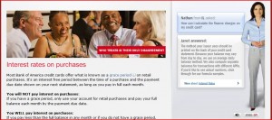
When the bank does settle down to present the nitty-gritty about overdraft fees—though still in the spirit of fluff—it rather audaciously begins the discussion with an emphasis on the failures of its clients. The page on the InfoCenter portion of the BoA’s site (not, technically, part of the banking center) concerning credit cards begins with these words:

“We’re all guilty of over-spending from time to time, even though we know we shouldn’t. In this section, you’ll find out why it’s so important to stay within your credit limit.” [endnote 4]

Later in this page [endnote 5], one of the headers, “Think before you spend,” suggests that the bank’s primary concern with its web page is to help you think. However, with the amount of fluff on this page—including an annoying woman, “Janet,” who steps out on to the page to address the visitor through audio and pretends to want to assist you [endnote 6]—the disingenuousness of this cautionary line are clear.

The version of this page concerning overdraft feels on debit cards starts a little more modestly, with the statement: “Ever written a check for an amount larger than you had available in your account? Ever overdrawn your account? Learn how to avoid these missteps.” However, “learning”—at least in terms of how to manage your money, and especially in terms of how to navigate their website—is not the goal here.

The section called “Defining Overdraft and Insufficient Funds” tells you what any customer of the bank knows—you are charged $35 for an overdraft. It does explain some details which one might not garner from experience—though, in fact, my experience contradicts this statement: “When we determine that your account is overdrawn $10 or more, you will be charged $35 for each overdraft item.” I thought the fee was triggered by much less than that. In any case, once the overdraft is charged, then any further purchases—they can be for a dollar, even less—will charge a further fee.

Following this statement are plugs for “Overdraft Protection,” which, as many know, involve getting a credit card (but not borrowing against the credit card according to plan of normal credit card spending—it has to be repaid within two weeks, and charges higher interest [endnote 7]) or maintaining a savings account with BoA—in other words, an advertisement.

What then follows is a section titled “Why you’re charged,” which, as in the credit card page, does not explain “why”—the costs to the company, the purpose, etc.—but what. We do learn here that higher items are deducted first, apparently as a courtesy, though as those of us who have had larger items deducted first, only to have smaller items—bottles of coke, for instance—trigger a series of $35 dollar charges, this is hardly courteous. (This phenomenon is called “cascading fees,” and is described below.) Why, with the sophistication of programming in our present time, an algorithm can’t be written to juggle the order of payments and minimize the costs to the customer, I don’t know.

They then tell you about the “Extended Overdrawn Balance” charge (first I’ve heard of it) which is applied when the balance is not fixed within 5 days. The purpose of this charge—clearly, it is punitive—and the cost to the bank—the “why” of these charges—is not discussed. As for their advice on how you can “help”—what a strange word to use here, as if the bank is simply helpless in enacting these charges—there are three themes: Online Banking, Alerts and Overdraft Protection. Of course, all of these either increase your reliance on the web or require additional activities with the bank.

In the middle of this page is a clearly highlighted link to the “Clarity Statement.” I will address this in the following section.

Note:
This post is a section of Bank of America Online Banking: A Critical Evaluation. This essay is also available as a book which can be downloaded for free at Lulu (where an inexpensive, not-priced-for-profit print edition can also be purchased) and at Scribd. The table of contents for the blog version of this essay can be seen in its entirety here.
The Clarity Statement [endnote 8] can be reached through links on the Bank of American website, and only recently as a link from Google. Apparently, the Clarity Statement—for credit cards, checking or both (I’m not sure)—were first issued in late 2009.

Much of this tells us what we already know from the website, though it does make explicit the new rates of penalization for overdrafts. These are “new” rates brought on by recent pressures from customers and the government in this time of recession. To this extent, the “Clarity Statement” can be seen as an advertisement, but also as a useful warning. I don’t remember receiving one in the mail.

The key paragraph in this document is the following, which to my knowledge doesn’t appear anywhere on the website:

“We encourage you to record all your transactions in a check register. This can help you keep track of your account balance and avoid overdrafts. Please note that the account balance that we show you may not include all of your pending transactions, such as a check you have written but which we have not received.”

The emphasis on the website—in blaring advertisements, talking Flash women in comfortable slacks, in images of happy fathers toting their children, in appeals to green sensibilities, and finally in calls to do banking on your mobile phones—is that banking with BoA can, and even should, be paperless. That the bank would suggest using a check register—who uses checks anymore?—in its Clarity Statement is a joke.

In calls that I’ve made in the past to the Bank of America concerning my overdraft fees, eventually the person at customer service will roll out the line with these very same words, “The Bank of America encourages you to…” Part of my motivation for this exhaustive analysis of the website is to show how hypocritical it is that customer service, and now the “Clarity Statement,” would try emphasize the inadequacies of their own customers in dealing with their product (and by product, I mean the Online Banking site, which—like the downloadable application available for iPhone [endnote 9]—is a piece of software).

A news story [endnote 10] on the Clarity Statement reported the following: “Our goal [with the Clarity State-ment] is to communicate clearly and make it as simple and easy to understand as possible so that they can use credit wisely,” Ric Struthers, president of the bank’s Global Card Services division, said.” I am not sure why a single sheet of paper is need to, or even could, explain the workings of huge website, and if clarity is so important, why doesn’t the Clarity Statement appear on the first page of the site?

Consequently, a link to the Clarity Statement—an actual webpage this time, but one that is not open to being Googled because it is behind the firewall—does come up on a search of the BoA site. The link is found at the very bottom of a page called “Fees at a Glance,” which like the other pages that offer fee information, is largely devoid of it. It is in a section with links about “more detailed information about your accounts.” The Clarity Statement doesn’t have any more detailed information in it. The sentence concerning keeping a personal register—paper or electronic—is unique to this hard to reach document, and contradicts everything else the website is telling you to do.

I am not wise enough to know whether the Clarity Statement has been created to help the bank avoid lawsuits down the line—they could always point to it and say “we told you!”—but I somehow doubt it. Nonetheless, it’s no help to users of the website. Consequently, most people under thirty have probably never written a check, and to tell them now to keep a checkbook to keep track of every little transaction on their debit cards is absurd.

Note:
This post is a section of Bank of America Online Banking: A Critical Evaluation. This essay is also available as a book which can be downloaded for free at Lulu (where an inexpensive, not-priced-for-profit print edition can also be purchased) and at Scribd. The table of contents for the blog version of this essay can be seen in its entirety here.

The Bank of America maintains a laughably inept website called the InfoCenter, which can be found at the following URL:

http://infocenter.bankofamerica.com

I don’t remember quite how I got to it, but it had to be through the BoA banking center in my attempts to find tutorials and information. However, the InfoCenter is clearly one extended advertisement. It purports to give you information such that you will become “all-knowing”—this is a direct quote from the home page—about the bank and online banking. In fact, the information it presents is trivial, over-designed and is broken up into tiny chucks in such a way as to deter browsing.

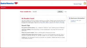
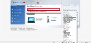
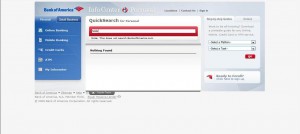
At the center of the page is a search box. One presumes that a search such as “What is a hold?” would bring up a few hits. This search box, however, is one of those where it begins to provide links for you as soon as you type a letter, such that if you type “What” a series of links appears (four, in fact). “What is a” brings up two hits, one called “Online Banking” and one called “Online Banking—Add a Payee.” “What is a hold”—even before hitting return—brings up the message “Nothing found.” The single word “hold” also brings up nothing.

Typing in the word “Over” brings up four hits, all of which have the word “Overview” in them. The moment you type “Overd” there are no hits. “Available Balance History”—the name of one of the more mystifying pages of the Online Banking site—doesn’t get past the “v.”

There is a note under the search box (actually, it is called the “QuickSearch for Personal” box) that states: “This does not search BankofAmerica.com.” Of course, this public website would not have access to the documents behind the BoA firewall. But, in fact, it searches nothing but titles of the handful of documents that compose the “InfoCenter.” They are all listed—when the hits come—in a box called “Popular Topics”—but popular with who? Where are the less popular ones—the ones about the penalties?

There are two dropdown boxes on the right hand side. “Select a Platform” has options for Online Banking, Mobile Banking, Credit Cards and ATM. Online Banking has the most options—in fact, what they seem to have done is broken down topics into several smaller topics so that you can only look at one little piece of information at a time. The dropdown box has three items called “Overview,” but in fact these just provide overviews for their relative sections. Because there are no bold spaces or indents in this dropdown box, you are not even aware that there are separate sections. This might seem the quibble of a web designer—my main point is that pretty much all of these tiny bits of information could have come in one document, since there’s not all that much there.

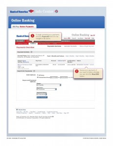
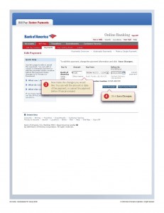
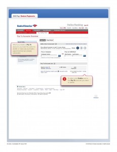
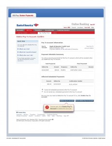
When you do decide to download a document—”Review Payments,” for example—you get very cartoon-like PDFs demoing the respective feature of the site. “Review Payments,” for example, shows you how to review a bill you’ve just paid with Online Banking and how to change the amount—not informing you, as I’ve learned, that you cannot change the amount more than a few days after you first set up the payment—and how to delete a payee. While I understand the usefulness of these PDFs in deflecting the calls to their customer service center for entirely mundane matters, they serve in no way to make you “all-knowing” about the site—they hardly get you started. Again, as a Disney-fied version of the same four bits of information (see example pages in the appendix) it is a form of advertisement.

None of these pages about “reviewing payments” tells you what I think is one of the more important—and otherwise absent features—of Online Banking, which is how to track whether or not a check that you have sent has been presented. The screen which you would use to do this appears in the PDF, but it is not noted for having this purpose. I’ll describe “Review Payments” screen eventually in this document.

The irony is that the “search” box—which usually suggests an exhaustive cataloguing of a wide array of information—is really just a toy that brings up at most 4 hits from a very small pool of documents. The drop-down boxes—which are usually used for a small number of topics—brings up many more than are needed, including redundant “Overviews.” The overall impression is one of a old-fashioned movie set, with a high and sturdy buildings being backed by plywood and such.

There are loads of videos [endnote 11], demos and PDFs on this site that go through a lot of the same basic information in several ways [endnote 12]. My sense is that this “InfoCenter” was created to make the services more attractive to new customers, and to deflect callers. Worse, though, is that none of them give any sense of the complexity of the site or the difficulties you might run into trying to manage a checking account with so many ways of making payments, which are the following:

  • Debit card with PIN number
  • Debit card used like credit card, with signature
  • Paying a bill to a company that deducts the day it’s sent
  • Paying a bill to a small company or individual that presents checks weeks later
  • Paying with debit card to a restaurant that will put a hold on your check
  • Having a monthly bill payment that was set up on BoA
  • Having a monthly bill payment that was set up on another site

There are probably additional ways to spend money that I haven’t listed—debit cards are increasingly ubiquitous, and new uses are always being discovered. Some examples of virtual purchases that don’t fall under the purview of the Online Banking site but which exhibit the complexity of virtual banking transactions include online auctions with automated payment, in which case the funds might not be deducted immediately, if at all.

This list testifies to the complexities of virtual bank transactions, not to mention the increasingly blurry line between a “credit card”—for which one applies, has an application reviewed, and signs a contract, and which is expressly related to one’s credit rating—and a “debit card”—which on the surface directly reflects funds that have been deposited in a bank, but which operates more like a credit card (poor use of one can kill your credit rating, but good use of one will never raise it), but one whose penalties can be triggered with alarming immediacy.

Paying for things now seems to me more complicated than in the days of checks and cash, especially given the immediacy of the penalties, and any website that was serious about helping its customers would respect that.

As a last note, the cynicism that went into the construction of the “InfoCenter” is apparent in the section called “My InfoCenter” which, like the QuickSearch box, seems to provide some of the services that one associates with a robust website—in this case, the ability to “save” useful tutorials to a personalized page for later reference—but which is in fact just another false front. The information that you can save are those superficial PDFs (and maybe Janet, too) that are easily accessed from the homepage, and no elements from the larger body of material available in the online center’s search feature (described below) can be saved here.

Note:
This post is a section of Bank of America Online Banking: A Critical Evaluation. This essay is also available as a book which can be downloaded for free at Lulu (where an inexpensive, not-priced-for-profit print edition can also be purchased) and at Scribd. The table of contents for the blog version of this essay can be seen in its entirety here.

The search function itself is not much more useful than that of the InfoCenter.

The Bank of American’s lack of interest in making the search function central to their online banking strategy is apparent from the start. The search box appears in the upper right-hand corner of the screen, with the phrase “Enter Keyword” embedded in it, rather than any text that clearly defines its function. It is merely a percentage of the size of the search window in the InfoCenter (placed squarely in the middle of the screen, and is endorsed by such phrases as “Want to be all-knowing?”).

The BoA search box is also much smaller than many of the competing graphics and text on any given page—its point size must be 6 or even lower. Clearly, the website designers did not want this search box noticed.

The information that can be retrieved from this search box is significantly more detailed than that of the InfoCenter. However, it doesn’t promote any sort of synthetic understanding of the website—that is, it doesn’t point out the interrelation of screens, or of data as it is presented in the site. For example, as noted elsewhere in this report, information from the Accounts Detail screen and that from the inappropriately named Available Balance History screen are not shown to have any relationship to each other.

Here is the complete text that appears with a search of “Available Balance History”:

What does the Available Balance History screen show?

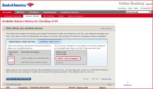
The Available Balance History screen represents a historical view of pending and posted transactions, as recorded during nightly processing (Monday through Friday, except holidays). You can trace how and why your balance changed over time, and when a change may have triggered a fee.

Four days’ worth of transactions are shown at a time, with a total of 93 [endnote 13] days of transaction history available.

On the Available Balance History screen, you may find the following historical transaction types:

AUTH-Authorizations represent check card transactions that were Pending and reduced your balance

HOLD-These transactions represent holds that were placed on your account and reduced your balance. These are typically holds on deposits.

Credit-Transactions that increased your balance.

Pending Credit-Credits that were made to your account after the bank cut-off time and increased your balance. The amounts usually post to your account on the following business day.

Debit-Transactions that decreased your balance.

Returned Debit-These are items, such as checks, that were not paid due to insufficient funds in your account.

To access the Available Balance History screen, select the “Available balance history” link in the Balance Summary section of the Account Details screen. Note: Available balance history is not available for Money Manager or Master Relationship Accounts.

Nowhere in these short paragraphs is the relationship of this screen to any of the others noted, nor is the particular function of this screen in determining your present balance outlined.

Consequently, though it does mention that holds will show up on this screen, it doesn’t mention that active holds—which themselves can trigger overdraft fees—will not appear on the Accounts Activity screen. It states that you may—I’m not sure why the verb “may” and not “will” is used here—find “historical transaction types.” This screen is far from a “history”—it is another part of the divided reflection of your banking status at the present.

Holds are dangerous. Here is the description of a hold in “5 Sneaky Overdraft Traps” (appended to this document):

Swipe your card at the gas pump and the merchant enacts a temporary hold for, say, $75 worth of gas, before the actual transaction begins. (Hotels and car rental agencies use similar procedures.) That hold lingers on your account for a day or more, even if the purchase turns out to be much less, warns Fox. Meanwhile, banks consider that hold money unavailable, thus lowering your available balance.

With the ability of a hold to trigger cascading penalties, shouldn’t this appear in the Available Balance along with debit purchases?

The documents themselves that are served up by this search box are poorly formatted. For example, text careens across the screen rather than being contained in a table, which would reduce the length of a line of text for easy reading [endnote 14]. Formatting is reduced to regular type, bold type, occasional blue type, and standard underlined blue type for inner-page hyperlinks. This is in stark contrast to the information presented in the InfoCenter. Where did the small army of graphic designers go when it came to creating pages for this useful information?

Likewise, the style of the writing is matter-of-fact, rather than rendered accessible, even attractive, in the InfoCenter. Free reign is given to arcane banking terms with no help given in providing these terms with definitions (via hyperlinks, or forums), for instance, which has become the standard on such websites as Wikipedia.

This lack of formatting and the lack of style or glosses in the language discourages reading and comprehension. Even when the explanations contain some detail, they are not accompanied with illustrations or other multimedia material that might assist the user in comprehension. The division of the information into small chunks of largely disorganized writing does not promote the synthesis of an understanding of this information.

Note:
This post is a section of Bank of America Online Banking: A Critical Evaluation. This essay is also available as a book which can be downloaded for free at Lulu (where an inexpensive, not-priced-for-profit print edition can also be purchased) and at Scribd. The table of contents for the blog version of this essay can be seen in its entirety here.
One search that does not produce any results at all in the Bank of America’s Online Banking website is the words “cascade” and “cascading.” In fact, searches for any keywords that are associated with the negative aspects of online or virtual banking or purchasing do not show results in the search box.

Cascading penalties are a frequent occurrence for online bankers [endnote 15], as can be demonstrated on the numbers of hits for the phrase “cascading overdraft fees” in the Google search engine—stark contrast to the zero hits of the BoA’s site.

Following are some of the headlines that came up in the first few pages of the Google search (these are clickable in electronic forms of this document). These stories range from well-researched articles by major news corporations to screeds by customers who have been stung—probably more in their sense of the rationality of the world than the wallet—by overdraft fees:

One debit-card overdraft can trigger an avalanche—LA Times

Overdrafts: An Involuntary Bank Bailout? – FOXBusiness.com

Banks Can Manipulate Your Transactions, Then Charge You %1750 Overdraft Fee

Chase Barrages Customer With Overdraft Fees – The Consumerist

Documentary Blasts Debit Card Overdraft Fees. – ATM & Debit News

Maryland Politics: Two Maryland victims of banking system meet—Baltimore Sun

Americans for Fairness in Lending – Overdraft Loans

Congress looks to limit debit card fees | Marketplace

Those record overdraft fees | StarTribune.com

New overdraft rules: Worst of both worlds? – The Red Tape MSNBC

ISS – Banks: Hit ‘em when they’re young—ISS

Five Sneaky Bank Fees – AOL Money & Finance

My3cents.com – Bank of America Complaint – Unreasonable overdraft …

Bank of America’s outrageous overdraft fees = scam .. (NSFW)

It’s surprising that any number of writers for the web (the last of this list is actually a Youtube video) would be united in their opinion that banks are abusing their abilities to levy penalties on their customers. News organizations that one might expect to provide muckraking research on corporations—such as the Los Angeles Times and the Baltimore Sun—are not surprising in these results, but FOXBusiness, and AOL?

The number of stories one the web on the predatory practice of banks are probably only rivaled, among human interest stories, by articles and posts about health, exercise and eating—which is to say, stories that help to explain to panicked readers the behavior of their own bodies, about which we all agree only an inadequate percentage is actually truly known. The interface to the Bank of America website, along with the vagaries of virtual transactions and overdraft penalties, should be easier to understand than the causes of cancer.

The surprising thing, though, is that, despite the interest that the Bank of America’s customers have concerning cascading purchases and how harmful they can be, this information does not appear anywhere on the site. (I did learn the term “cascade” from a BoA representative about ten years ago, but representatives have obviously been told to avoid the word since then.) The world outside of the Online Banking site is rife with horror stories of outrageous penalties, while on the inside, all is rosy.

The Bank of America, via its InfoCenter and other fluff devices, along with its poorly constructed FAQs and search results, pretends to have the customer’s interests in hand in helping them avoid fees. However, a well-constructed tutorial on the details of online banking, or any note of the possibly outrageous consequences of cascading overdraft fees, does not appear on the site. Explanations of where these “fees” actually go—a “fee,” like a student activity fee, should be funneled into some service for the payer—is totally absent.

The Bank of America Online Banking site confuses the job of advertising with the job of educating. It is probably the only instance of a piece of software that advertises—rather than offers serious explanation of (where’s the “help” button), its features as you are using it.

Microsoft Word, for example, does not constantly remind you of how easy it is to use Word as you are creating a document—it’s quite frank about how complex it is, and provides searchable help pages and other features to help you negotiate it. Of course, a mistake does not cost you 4 x $35 in penalties. A sturdy, honest, well-written 30-page manual distributed to any new customer of the site would go a long way to address this [endnote 16].

It is not that concise documents on such subjects in accessible language are hard to write, nor are the concepts so esoteric that anyone with less than a college degree can write them. It is merely that there is an unwillingness by the Bank of America to provide such warnings about its website, which it fails to understand is a complex, and largely imperfect, piece of software that provides many opportunities for accidents.

Appended to this document is a short article published by AOL titled “5 Sneaky Overdraft Traps” that (with a different rhetorical emphasis) could serve as a model for a page of a manual for the site [endnote 17]. There’s more in this article to help a user of online banking than appears in the entirety of the “InfoCenter.”

As mentioned earlier, there is no way to get information online about transactions that occurred more than 6 months previously (or 3 months in the “Available Balance History.”) This is a problem for doing taxes if you are not receiving paper statements as the bank wants you to.

I guess a digital statement could replace it, but having this information searchable would go a long way in educating the user on previous mistakes [endnote 18]. And if you are have had a dispute with a payee from more than 6 months back, you won’t have any easily-available record of having made the payment and might have to pay it twice. There are few features on the BoA that serve the consumer in appealing a case in court—both against the bank and against other businesses.

Certainly, a bank that seems to want to help you would keep this information current, since no one can keep in mind the plethora of ways to be trapped by the site.

Note:
This post is a section of Bank of America Online Banking: A Critical Evaluation. This essay is also available as a book which can be downloaded for free at Lulu (where an inexpensive, not-priced-for-profit print edition can also be purchased) and at Scribd. The table of contents for the blog version of this essay can be seen in its entirety here.
For many of the bills that one would pay through the Banking Center, the funds are deducted from your account on the day they were set up to be paid (that is, if you set up the payment a week or so in advance). However, many bills, and of course all checks to individuals, sent out through the Banking Center will not be deducted from the account until the payee has presented the check to the bank.

Upon setting up a series of checks to be sent out, they are all listed in the left-hand column of the page as being scheduled. Conveniently, the sum of the various checks is also presented. On the day the checks are sent—the pay-by date—these checks continue to be present on the left hand column with the status “Sent Today,” assuring you the checks are in the mail.

However, a day later, all of these sent checks disappear from the main page. You can see, by scrolling down the page and looking at individual accounts, that they have indeed been sent (or “processed,” an inexact term as it suggests a completed transaction). This is an easy bit of information to present—checks that have been “processed” but not presented—but the BoA site decides to avoid it.

To determine which checks have been sent and presented, one has to move back and forth between these two pages and match up the sent checks with those presented. If the check has not been presented, there is no way to know what is happening with the check. There is no easily available piece of information on pending checks paid through online banking (of course, checks paid in paper would not appear there, though a space to input this information would surely be useful), as there is for pending debit card purchases, or holds (both pieces of information, consequently, are themselves presented on different pages).

This is, one supposes, one of the primary reasons that Clarity Statement asks you to keep a personal register. If you—like I do—send out fifteen checks or so on the first of the month or on payday, and a few thereafter, it is impossible to remember which company has presented their checks even if (or mostly if) the majority show up in the Accounts Detail page.

What happens—and this is what happened to me [endnote 19]—is that a check will be presented some weeks after it has been sent, and you will have forgotten about it, or have been unaware of it not having been presented entirely, and it will be presented against insufficient funds.

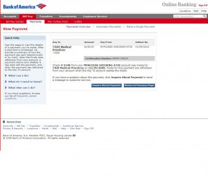
Reviewing these payments in the screen attached to the individual payee will show that the checks have both been processed on the day they were assigned. I discovered, after clicking around a bit, that the “View payment” link next to an individual check—which takes you to the page which the above tutorial suggested was only useful for making or changing a value—has a single line of text different between similar pages for presented and checks not yet presented. Presented checks have a sentence stating “Funds were withdrawn from your MYCHECKING account on [the date].” Pages for checks not presented state: “Funds for this payment are withdrawn from your account when the Pay To account cashes the check.” The difference between these two pages is just these two phrases.

This is the only place on the entire website where information about unpresented checks exists, despite the value of this information—along the lines of holds and pending debit card purchases. Considering that checks are often written in large sums—one doesn’t write a check to buy a can of coke—the check is most likely to be deducted from the account first, which then triggers a series of overdraft charges.

Worse, those of us who are hitting the end of our available balance tend to buy a lot of little things to avoid having an overdraft—buying, then checking to see if the recent small purchase has been reflected on the site. Hence, a series of overdrafts will be triggered after the first big check came in. (My own example is having a check for $140 to a doctor I sent in my previous state not be presented for a few weeks. I was hitting the end of my pay period and so was making small careful purchases. The result was 4 overdraft fees on one day, and 2 on the next!)

Why BoA does not provide this useful information—as easily as it is provided on other online banking sites—is an open question. I suspect that the income brought in by this frequent occurrence—which is never addressed in the fluffy tutorials and InfoCenters on the site—is useful for the bank’s budget.

As for “alerts” set up for when your balance is getting low, they are useless for those of us who check the site obsessively [endnote 20] and know quite well when our accounts are low, and also useless as they don’t consider holds and unpresented checks [endnote 21].

Even worse, in my many calls and to the bank’s customer service, none of the representatives were able to provide me with this information. Finally, I got one person on a chat session who showed me where this was, but as you can see below, it was after he had to check with his boss or some other references—that “hello?” was for when I thought I’d lost him. And, in fact, his first answer was the answer I often got over the phone, which is that you don’t know about these checks until they are presented. I asked him the same question, but in different words, to get the final answer:

You: I have a question: if I send out a check through Bill Pay but it hasn’t yet been presented at the bank, is there anywhere on the website where I can find out the status of that check. Does it show up as “pending” on my account?

S: The draft checks we mail to the pay to account will only show reflected on the account once the pay to account has cashed or presented the check for payment.

You: Ok, so say I mail out the check on the first of the month (along with 14 other check I send out through bill pay on the first of the month), how do I find out whether or not that particular check as been presented?

You: Is there any screen where that check, and not the 13 other checks, is singled out as not having been presented? I ask because I’ve gotten in trouble with this.

You: Hello?

S: I see. The check numbers for each of the payments is listed in the Payment Details screen and can verify if the payment is posted against the account with the check number.

You: So I have to click through to the View Payment for each check to find out?

S: To verify each payment is cashed, yes you have to click through the payment in question.

Well, I don’t want to be too hard on the guy—there was probably just some miscommunication here, though it took him a long time to parse my sentence—but this is certainly information I never got on the phone. And this chat session illustrates a pretty frank admission to the difficulty and tedium involved in following through on every check in Bank of American Online Banking.

Note:
This post is a section of Bank of America Online Banking: A Critical Evaluation. This essay is also available as a book which can be downloaded for free at Lulu (where an inexpensive, not-priced-for-profit print edition can also be purchased) and at Scribd. The table of contents for the blog version of this essay can be seen in its entirety here.
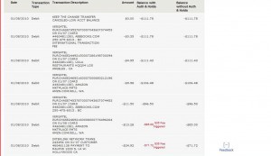
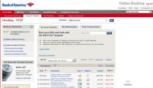
The one page that most BoA banking center people are going to use is the Account Activity page. This has a list of transactions and a number called the “Available Balance.” As you may have gathered by reading this so far, the “Available Balance” does not reflect purchases made with a debit card that were signed for (I learned this little detail by pestering a phone representative, not through my pouring through the website), holds or, of course, pending checks.

(In the old days, I remember that all checks sent through Bill Pay were deducted from Available Balance immediately upon being sent even if not presented, which I much preferred. I don’t think there is an option to switch that on with the bank.)

There is a small link in the upper left corner of the page called “Available Balance History.” On this page is another set of transactions that appears quite similar to the first page, but with two columns of figures, each of which is topped by different numbers. One number is your account without holds, one with—but neither of them is the actual “available balance.” At least, in my experience, neither of these numbers always matches up with the “available balance.”

Occasionally, I have had this number be larger than my available balance, and occasionally smaller. And despite the fact that it is called a “history,” it is in fact often more current than the information on the Available Balance page of the site. It’s not presented as the go-to page for information on the site, but rather as a way to gaze on the past—but if you make a lot of purchases for which the company has put a hold on a sum of money from your account, you won’t see any note of it on the Available Balance page. It will show up here.

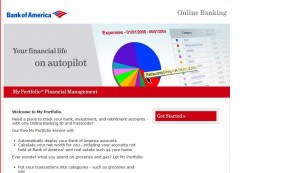
There is another section of the site that appears to combine this information called My Portfolio, but I don’t know how to use it. I assumed it was for people who had investments, stocks, property, etc.—hence the term “Portfolio”—and not for poor writers like me who don’t own anything and never use the term “portfolio” in relation to money.

However, on glancing at it, I notice that it presented yet another image of how much I was worth. Here is the breakdown:

  • Account Details—checking: $136.77
  • Account Details—saving: $7.5
  • Account Balance History w holds: $111.78
  • Account Balance History w/out holds: $111.78
  • My Portfolio: -$104.19
  • Accounts Page: $0 (but this is obviously not true)

If you add the two figures from Account Details, $7.59 to the -$136.77, you would get -$129.18, yet another number.

The My Portfolio number comes from adding the small amount of money I have in my savings to the number on the Account Balance History page (both being the same this time, I don’t know which exactly). So, with all of these numbers flying around—it seems the My Portfolio figure is the most accurate, if still off considering the disappeared pending checks—maintaining a sense of your balance when you are getting very low is difficult, if not impossible.

It should be noted that, in all of my transactions with customer service through the phone and in chat, none of them have suggested I activate My Portfolio. (I confirmed this once again, in my final chat session, below.) The lead page for My Portfolio when it is not activated suggests that it is only of use to people with stocks and investments, which is why, until I started researching this paper, I never set it up [endnote 22].

Consequently, the Available Balance History is geared more toward letting you know what went wrong—i.e. arguments in favor of the bank when you are on the phone with customer service. Visual information on what the user was seeing on the day he or she made the bad transaction is not available, and is entirely masked by this screen.

Of course, this is the way it is with most websites, though sites like Facebook let you look back at the history of what you have done exactly as it looked when any transaction was made. This feature—while admittedly hard to implement—would be good for presenting cases by customers, not to mention as a way to educate the customer in what went wrong [endnote 23]. The only way to keep a record of what it was you were looking at on the day of the bad transaction is to do a screen capture.

Note:
This post is a section of Bank of America Online Banking: A Critical Evaluation. This essay is also available as a book which can be downloaded for free at Lulu (where an inexpensive, not-priced-for-profit print edition can also be purchased) and at Scribd. The table of contents for the blog version of this essay can be seen in its entirety here.
Every U.S. Citizen pays $126 per year in overdraft fees. Following are a sketch of how I’ve come to this conclusion and its repercussions for how we feel as citizens and who, indeed, is providing the governance in this country.

U.S. banks will gather record of $38.5 billion in overdraft fees [endnote 24]
http://money.cnn.com/2009/08/10/news/companies/bank_overdraft_fees_Moebs/index.htm

Population of the United States: 304,059,724
http://www.google.com/publicdata?ds=uspopulation&met=population&tdim=true&q=population+of+united+states

This amounts to $126 per person in the United States per year in overdraft fees.

Subrtract the population that makes $100,000 or more (15.7 percent of U.S. households in 2005):
http://en.wikipedia.org/wiki/Household_income_in_the_United_States

That amounts to $145 per person in overdraft fees per year for someone middle-class or below.

That’s an average of 4.1 overdrafts per person a year. Most of us with decent jobs [endnote 25] are not making 4 overdrafts per year—so who is?

(Here’s one answer: “Overdraft fees affect student finances”
http://www.kansan.com/news/2009/dec/10/overdraft-fees-affect-student-finances/

Here’s another: “FDIC: Bank overdraft fees hit young, low-income customers”
http://www.usatoday.com/money/industries/banking/2008-12-02-fdic-study-overdraft-fees_N.htm)

These are figures entirely for debit cards fees. They don’t include other banking fees or fees collected for credit card transactions.

They are fees for purchases ranging from a single bottle of coke to a few books to a night at a restaurant. One doesn’t get a $35 for going over in buying a flat-screen TV. If you get it for spending $1,000 at Saks, I don’t think it’s that much of a biggee.

An overdraft “fee” is essentially a penalty—banks never tell you exactly where these fees are going, and what harm your overdrafts are actually doing to the bank, so they behave more like parking tickets than service charges. That is, overdraft fees are more like penalties from the government than from a service provider.

Debit cards are regarded more like credit cards than as easy access to funds you deposited in a bank. That is, they are treated by the banks as money that has been leant to you, and that you have not paid back in a timely fashion. But whereas you are given several weeks to pay back your credit card, you are charged immediately for overdrafts, with no basis to contest a “fee.”

This effectively amounts to the criminalization of every citizen in the United States who uses a debit card. This is basically everyone.

Debit cards, along with online banking, are interfaces. They are ways to manipulate data (behind which most of think is something “concrete”—that is, money).

All of the major banks are moving in synch in terms of the amount of overcharge fees they charge ($35), and even in terms of when they make policy changes (three of the major banks announced changed policies in in September, 2009).

This effectively amounts to a monopoly, and should be subject to the anti-monopoly laws that Microsoft was subjected to regarding their operating system [endnote 26].

But bank monopoly is worse since, after all, Apple was able to provide significant competition to Microsoft during their more dominant years, and independent programmers were able to develop Linux which could have stepped in if things got really bad. With changing technology (such as the rise of Google and increased reliance on the web and smart phones), Windows was (or will be) destined to be an option among many anyway.

Under present conditions, with involuntary reliance on debit cards, no competition can arise against the four major banks. I can open a bank, but I can’t open an ATM (an extension of the interface) on every other street corner.

The amount of money that is circulating to the four major banks through penalties dwarfs the amount of money attached to causes that drive people to referendums, protests and renegade political campaigns [endnote 27]. This implicates politics itself as largely ignoring the major foci of the circulation of money.

People with a desire to control where their tax money is spent are largely arguing over peanuts as far more of their money is circulating in ways that do them no social services at all, not to mention the basic function of easing money transactions.

Note:
This post is a section of Bank of America Online Banking: A Critical Evaluation. This essay is also available as a book which can be downloaded for free at Lulu (where an inexpensive, not-priced-for-profit print edition can also be purchased) and at Scribd. The table of contents for the blog version of this essay can be seen in its entirety here.
The extent to which the public relations and advertising departments exercise their influence is visible in the number of “reviews” of their online banking services that appear on the web and the way these reviews echo the promotional material of their relative banks.

None of the websites that review online banking ever perform their tasks with the sort of diligence with which even a second-tier electronics or computer site would do it, not to mention music and movie review sites. But whereas a bad decision on a movie could cost about $15, and a bad decision about electronics will probably just get you an item that is marginally less useful than another brand’s competing product, a poor choice in an Online Banking site could cost you several hundred dollars over the course of several years.

How many people read these reviews? Probably few, since the public knowledge of the importance of good software for managing their account is very low. Most people assume (as they do with computers that are pre-installed with Windows) that they are pretty much stuck with the interface and system a bank has provided. And of course, they are.

None of the reviews sites that I’ve visited perform serious evaluations of the services from the perspective of a user. I don’t, for instance, see information on how easily or accurately these sites represent active transactions—holds, pending checks, etc. They all assume that the sites are quite easy to learn for a user without a manual, and don’t evaluate the educational or cautionary materials on the site. They assume a sophisticated user, and obviously one with a substantial amount of income, whose balance never sinks below $150.

I was actually afraid I’d have to do a lot of reading for this part of the report. In fact, the amount of writing is pitifully small. Here are brief evaluations of the reviews I’ve seen online:

Consumer Search—”Online Banking: Reviews”

http://www.consumersearch.com/online-banking

This site decided that the Bank of America’s Online Banking service was the best. They expend one paragraph on describing why this is so; no other bank appears to have been evaluated (i.e. there is no second place), and no criteria are provided. They sum up their meager arguments with the following bullet points, most of which have nothing to do with the banking center software itself:

Pros
• High customer satisfaction
• No fee for over 18,000 ATMs
• Free online checking, no minimum balance
• Free online money-management software

Cons
• Phone support not 24/7
• Fees for using other banks’ ATMs
• No interest on checking
• Low interest on savings

How is “high customer satisfaction”“ a feature of a site? That’s like saying someone is a good athlete because of his press. What do ATMS have to do with the online website? The freebees also have nothing to do with functionality (and free online checking sounds like a siren song to pull you into their system of overdraft fees, since it’s only those of modest income who could care for a checking fee.)

With the exception of phone and chat room support—which itself is largely superficial—none of the cons have anything to do with the functionality of the site. This is pabulum.

Forbes Reviews—“Website Reviews: Banking”

http://www.forbes.com/bow/b2c/category.jhtml?id=3

Bank of America

With the merger of Bank of America and Fleet, customers have learned the hard way about incompatibility. The two online banking systems cannot communicate with each other. All new customers sign up with what was formerly FleetHomelink, but with some of the added heft of the merged banking powerhouse. Chief among the merged-bank perks: more than 16,000 ATMs within the Bank of America system means you should rarely pay a fee. Other pluses: Checking is free with direct deposit, otherwise $6 per month, and there’s no minimum balance requirement. Online bill paying is free with checking and you can get account balances and information up to the last 18 months activity.

BEST: Large network of free ATMs.

WORST: The account aggregator is for Bank of America accounts only.

This is the entirety of the review from this prestigious magazine, in a section called “Website Reviews.” They attempt to provide the sheen of substance by reviewing an additional 17 banking sites, but none are granted more than a paragraph of attention.

Once again, the number of ATMs is somehow noted as a feature of the banking site. A large part of the paragraph is devoted to the ephemeral problems associated with a merger. And this review only has two bullet points!

Star Reviews—“Online Banking Website Reviews”

http://www.starreviews.com/bank-of-america.aspx

This site does note that the Bank of America website is pretty complex, but the review is largely fluff, and actually starts with advertising BoA’s ridiculous “keep the change” feature [endnote 28] which allows you to accrue a few dollars here or there over the course of a few months.

And they do talk a bit about the interactivity on the site:

Our first impression when hitting the Bank of America landing page was, “Where in the world do we start?” There’s just so much there. Yes, the website is broken down into sections, but for some reason that’s not completely apparent at first and you get an initial feeling of being overwhelmed.

Once you have time to brace yourself and actually take in the entire Bank of America home page, it’s not hard to find what you’re looking for. Links for checking accounts, credit cards, savings accounts, CDs, mortgages, home equity loans and more are all available from the landing page.

When you click on the links you’re interested in, you may find a slight delay in being taken to the actual product you want to read about. The pages on the Bank of America website, while easy to navigate, did load rather slowly. This is a considerable problem when looking at numerous products and services (as each one has main categories and then subcategories for each specific product offered).

Speaking of overwhelming—the sheer volume of products and services offered by Bank of America is enough to drive anyone to the edge. Researching checking accounts alone, you’ll find there are five different kinds to choose from. And credit cards? There’s more than 400 of those to look at.

This last paragraph gives it away—it spins the idea that the website is complex into an endorsement of the apparent magninimity of the site. The piece ends with bullet points again—one each for pro and con: “Upside: Wide variety of products and services, reasonable fees, unique programs. Downside: A bit overwhelming.”

This site does review six other banking sites altogether, but with no real purpose—most of the material is clearly lifted from the promotional material. If this type of reviewing were to occur in the book publishing or film industry, it would be scandalous, not to mention cause for legal action.

MSN Money—“The top 10 online banks”

http://articles.moneycentral.msn.com/Banking/BetterBanking/TheTop10OnlineBanks.aspx

This site doesn’t provide reviews of individual sites but does offer a table at the bottom that compares features among 10 banking sites.

One paragraph in the story—which is otherwise explaining some of the language and practices they used in the review—does put the top three banks up against each other, and gives you a sense of the criteria governing their judgments:

“Wells Fargo is ranked first, in part because of its Quicken-style tools for viewing your spending habits. Then again, second-place Citibank is better than Wells or third-place Bank of America at “money movement”—the ability to funnel funds to another account, user or bank. Fourth-place E*Trade Bank provides excellent alerts (such as letting you know when your balance is low), but it doesn’t allow you to stop payments on checks. Reverse that for fifth-place Huntington: no low-balance alerts, but it will let you stop payments. E*Trade also does an excellent job integrating its online banking and brokerage services.”

This page is titled “The Basics” and is, in its way, the least pretentious and most helpful of the review sites I’ve remarked upon here. Most of the story is geared toward helping you develop some basic analytical skills when looking at sites, though, again, none of this is concerned with the nature of the data presentation. The mention of “Quicken-style tools” is unique, as it does show the relationship of the a piece of commercial software and what is commonly thought of as a website—but is in fact a piece of software—the Bank of America Online Banking center.

None of these review sites do what most other review sites do: imagine a plethora of types of people who are using the service—ranging from the occasional user to the “power user”—nor do they provide any more detail than might be able to be gleaned in a brief visit to the site. It doesn’t appear, for instance, that any of the reviewers actually started an account with the respective banks and used them over a course of a few months, nor did they petition the opinions of users of the sites.

These reviews are largely an extensions of “InfoCenter”-style information, but provided under the aegis of objectivity, and like all reviews that are published under false pretenses, are essentially—think of the abuses of the Hearst era, when one man owned all the major papers—subject to prosecution, if not by the law, then the media.

Note:
This post is a section of Bank of America Online Banking: A Critical Evaluation. This essay is also available as a book which can be downloaded for free at Lulu (where an inexpensive, not-priced-for-profit print edition can also be purchased) and at Scribd. The table of contents for the blog version of this essay can be seen in its entirety here.

Bank of America Online Banking is a complex tool, on a par with a piece of financial software that one can purchase such as Quicken. However, there is no guidebook available online on how to use it, nor are there tutorials that are created for anyone with more than a basic knowledge of the site.

With all of the investment that is being made into the promotional material on the site and the rather advertisement-oriented InfoCenter—which gives the sheen of presenting the entire story, and which is mostly redundant for many users—one can only conclude that the Bank of America, with its high reliance on penalty fees for its income (probably the first time in its history that it made such a large sum of money from the lower and lower-middle classes) is purposeful in this exclusion.

The software doesn’t do what it says it is doing. Granted, there can’t be an exact corollary between the information on the site and what is in the database on a moment-to-moment basis (quite often, oddly, the user is looking at info that customer service can’t see yet, which makes resolving issues in a timely manner impossible [endnote 29]), but the information that is available on the site should be consistent with itself—across several screens, such as the Accounts Details, Available Balance History and My Portfolio—and synthesized if the idea of “ease” is to be attached to online banking.

This product, which is a very inexact impression of the activity of your virtual purchases, never contradicts the impression that it provides an omniscient view of your transactions.

Worse, in times of heavy purchases—right after a paycheck, for example, when a number of checks will be sent out, and when a consumer is likely to be more lax in their “surplus” spending, and so might have a dinner out with a friend—the website is least accurate as to what you have spent. In fact, it seems to go into a hysterical, aphasic mode, in which all sorts of important details simply disappear until you have stopped any significant spending.

My analogy, here, is to a gunfight. When there are several participants involved, you are never sure of who has been struck, who is still standing, and who is aiming at whom. One waits until the “dust has settled” before venturing to walk the street. This is what happens during the most volatile moments of spending by the average consumer—a complete loss of orientation until all of the checks have come in, the holds settled, the signed debit purchases submitted. Despite information about all of these transactions being available to the site, they are never tallied against the “Available Balance” until the end.

Am I asking the website to see the future? Yes, in that the data concerning all of these transactions, along with the policies of when these transactions are debited from the account, are present in the database. All of these figures—what is outstanding of checks sent through Billy Pay (and written, if the site allows you to input it), holds, debit transactions and the order in which these debits will occur—are logged somewhere in the database of Bank of America, but it chooses to keep this information from you until it appears on the Accounts Details page.

Failures in web design and functionality of the Bank of America website cost modest-income consumers billions of dollars each year—that’s millions of consumers! Bank of America doesn’t demonstrate that they take this issue seriously enough when improvements to the site seem geared toward adding silly Flash tutorials, or geared toward richer people with a larger number of investments.

The expectation with online services today, as with most commercial computer applications, and especially among younger and “power” users, is comprehensive knowledge of what your interactions and their effects, that is, information that is accurate to the moment, and even—if its available—the future moment. If there is something in the database that can provide the user foresight, it should be readily available. Where the Bank of American website deviates from this—because of the insuperable limitations on the software—it should be clearly, and loudly, stated.

The BoA won’t do this because it will make its product—Bank of America Online Banking—appear flawed, and yet most products that can do harm to an individual based on their use or functionality—an insulin pump [endnote 30], cooking appliances, even (grudgingly) cigarettes—are not afraid to sound alarms for users (as opposed to placating them with testaments to their “ease” of use) even in the active moment of using them.

The expectations with online web services—especially with younger people with lots of computer experience—is a conglomeration of facts and numbers, and placing relevant facts in apposition to each other for easy “browsing,” if not deeper analysis.

This problem will be aggravated with mobile phone users unless it is emphasized that the website has more complete information (and it tells them where this information is). If the information is off, or incomplete, even by a small margin, it makes a great deal of trouble for those of us who, on a normal day, can make twenty or so transactions with a single debit card, the irony being that, when we have less, we are buying smaller things, raising the number of possible overdraft fees.

While some of the changes that have been made in the policies have been good for publicity, they don’t really help at all for those who are: poor and often operating with under $100 in the bank; not well-educated or able to deal with figures (and who should probably just stick to cash, though that is not an option); or those who work freelance and hence go boom-to-bust (especially, as in my case in this instance, right after Christmas), and are dealing with sending and receiving payments to companies that (for example) will never become part of the much-vaunted e-Bills system, which advertises an even speedier deduction from your account. It is these people who will pay the majority of the overdraft fees, not the rich who deposit and spend larger sums of money at a time and who won’t be bothered by a $35 fee.

The larger philosophical and economic conundrum—certainly transcending the present concern with the BoA website—is the blurring of the boundaries between a “credit” card and a “debit” card:

  • Why are users penalized for an overcharge on a debit card on a daily basis, whereas overdrafts on a credit card are not reflected until the end of the month?
  • Why does “overdraft protection” when it relies on a credit card operate along completely different rules than with a proper credit card?
  • Why does good behavior with a credit card reflect positively on a credit report—which, as I write earlier, is a supra-governmental measure of your relative worth within society, like a prison record—and yet good behavior with a debit card is not rewarded?
  • How are differences in these two relative fields of virtual transaction reflected in the rate of penalties—which suggests that mismanagement of a debit card is more harmful to a bank than mismanagement of a credit card?

Consumer debit cards and checking accounts are, in even the most superficial of analysis, far less of a danger to the operation of a bank than credit transactions—after all, the present recession was brought on by mismanagement of mortgages, a form of credit. It was also brought on by “predatory practices” in terms of acquiring new customers, but surely, given the amount of deception inherent in online banking advertisements—most peculiarly that of Bank of America—such predatory practices have migrated from the mail to the web screen, and from the deceptive practices of prose and graphics to the more compelling rhetoric of software, interactive demos, talking Flash ladies, and bogus search engines.

It must be made to clear to banks that online banking centers are, like all computer interfaces, a form of rhetoric. They provide arguments with the nuances of their graphics, the placement of their hyperlinks and the text used in them, the various Flash animations and help files and FAQs, as well as the entire impression a single page can give of providing a comprehensive, bird’s eye view of your account.

Online banking replaces the teller in our interactions with banks—that individual who could, like a doctor, be trusted to offer cautions should your bank account appear to be heading in the wrong direction, and from whom you could get immediate, humanly understandable answers.

If a teller, upon pulling up the information about your account, were aware of such matters as pending checks, holds and debit transactions that were signed rather than enacted with a PIN—all information that is present in the bank’s database—but failed to tell you about them when you were dealing with him or her, you would think it strange, if not outright deceptive. If a teller gave you three different figures that each reflected some view of your “available balance” but then asked you to take out a calculator right there in the bank to determine their relations to each other (and without providing you with a substantial description of what the figures meant), you would be baffled.

The one time my fee was waived, it was done so under the guise of “stuff happens”—as if, after a simple lesson, one would never make that mistake again. But I, personally, have made several different kinds of mistakes [endnote 31] with this website—rarely the same one twice—and they have cost me dearly. This isn’t due to the complexity of banking in general—in the days of cash and checks, one could not make so many virtual transactions in a day, and could not be misled by a complex screen of information—but to the failures, in conjunction with the ubiquity of debit card purchases, of Online Banking sites such as that of the Bank of America.

Note:
This post is a section of Bank of America Online Banking: A Critical Evaluation. This essay is also available as a book which can be downloaded for free at Lulu (where an inexpensive, not-priced-for-profit print edition can also be purchased) and at Scribd. The table of contents for the blog version of this essay can be seen in its entirety here.
Following are several images illustrating the points above. I’ve chosen not to include helpful arrows or highlights to give the viewer a sense of how the information is organized graphically.
These were all captured on a weekend in which several overdraft fees were visible in my account, and yet when the damaging check had not been fully processed—a rare occurrence for highlighting these contradictions in the site before the “smoke settled” and they entirely disappeared.

Click to enlarge
________________________________________

InfoCenter Page with dropdown (only half of the list of subjects is visible)—all of the information from these PDFs could have fit on a page:

InfoCenter Page with “hold” as search item:

InfoCenter page with “overdraft” as search item—I couldn’t even complete word:


Payment Detail for check that has been presented:

Payment Detail for check that has not been presented—the difference of a few words in tiny print:

Checking Account Details with Available Balance History Link—note balance figure:

Available Balance History (header excluded)—very different presentation, different balance figure:

My Portfolio prior to joining—“Your financial life on autopilot,” in huge emphatic letters encouraging you to be less vigilant:

“Janet” the Flash lady in the InfoCenter—she starts talking as soon as the webpage loads:


“Janet” answering pseudo questions in a very highly-designed interactive Flash app. I was sent to this page by a customer service representative to get more details on my questions:

Format of the “Top 10 FAQs” page with rudimentary graphics and navigation:


My InfoCenter—like all “my” style websites suggesting you can limit a huge wealth of information to a personal, easily referenced page—but, in fact, you have about 40 pages of info to collect:

Here’s another Flash lady I discovered late in the completion of this report. You can find her on Google by searching “Bank of America Online Banking,” and clicking on “Online Banking User Guide.” She doesn’t give her name. As you can imagine, this is anything but a guide:

First page of the Clarity Statement—“We encourage you to record all of your transactions in a check register.” This would include, one imagines, every can of coke, pack of gum, etc:

The second page of “Clarity Statement” states that you cannot be charged more than 4 times a day. Of course, you can be charged another 4 times the next day—a cosmetic update:

Understanding Fees page with “Clarity Statement” link at the bottom. Tellingly, in the chat session that is transcribed below, the customer service represented, upon being petitioned, wrote: “I can assure you there is no such statement.” It’s buried so deep in the site that even the employees of don’t know about it. The website designer doesn’t, either—it is listed as providing “more detailed information about the account,” when it’s purpose was the opposite. Note the lack of glosses on any of this link—the user has no idea where he/she is going:


Search results for “My Portfolio”—largely further promotions of the product:

Search results for “cascade”—a word that many users of Bank of America Online Banking know, but which is not a part of the BoA lexicon:

Tiny search box on standard BoA online banking page—much smaller type, no clear endorsement like “become all-knowing,” crowded out by competing graphics:

The “Review Payments” tutorial from the InfoCenter—no mention made of the variations in amount of time before checks are presented:

Second page of tutorial—note how speech box for the “save changes” button informs you that you should use it to “save changes”:


Page three of the “Review Payments” tutorial. We’re back at number one with no transition. We’re told to click the “delete” button to “delete” a payee:  

Page four of the tutorial—one final piece of redundant information:

The new Bank of America Online Banking software for mobile phones—this isn’t software? iPhone users can get this through the iStore:
 

Page from Edward Tufte’s The Cognitive Style of Powerpoint outlining some of his arguments about the Space Shuttle disaster in 1986. [endnote 32]

Images of books that provide detailed information on much simpler software. Why has there been no book on Online Banking published since 1999?

Note:
This post is a section of Bank of America Online Banking: A Critical Evaluation. This essay is also available as a book which can be downloaded for free at Lulu (where an inexpensive, not-priced-for-profit print edition can also be purchased) and at Scribd. The table of contents for the blog version of this essay can be seen in its entirety here.
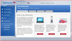
Following are some individuals to contact within the Bank of America to escalate a contended fee. Note that, in my last chat session with the company, none of these names were brought forward as people I could contact. This information is courtesy of The Consumerist website, and is current as of October 7, 2008 [endnote 33]:

Call Executive Customer Relations:

Executive Customer Relations general line: 704-386-5687

Martha Dominguez, Executive Customer Relations Specialist: 714-792-4264

E-mail the BofA Customer Advocate:

Nancy M. Condos: nancy.m.condos@bankofamerica.comail

VP/ Customer Advocate

Executive Customer Relations

Office of the Chairman

Or try the CEO:

Kenneth Lewis, CEO: Ken.d.lewis@bankofamerica.com

100 N. Tryon Street.

Mail Code NC-1-007-18-01

Charlotte, NC 28255

[Note: the information above is a bit outdated; visit the following page to get the latest information: http://newsroom.bankofamerica.com/index.php?s=20]

Consequently, I had no knowledge of the Bank of America Overdraft Fee Class Action Settlement [endnote 34], but it seems like it’s time to get beyond these one-off settlements and push for some real, rather than cosmetic, change in policies.

Another tactic that seems to have had some success, though I doubt very much, is the Executive Email Carpet Bomb, described on The Consumerist thus:

Here’s a classic tactic for rattling the corporate monkey tree to make sure your complaint gets shoved under the nose of someone with decision-making powers. Let’s call it the “EECB,” or Executive Email Carpet Bomb…

1. Exhaust normal channels.

Have you called customer service? Asked for a supervisor? Hung up and tried again? Give regular customer service a chance to fix the problem before you go nuclear.

2. Write a really good complaint letter.

Be clear, concise, polite, and professional. State exactly what you want. See this post for complaint letter writing tips. Pitch your issue in a way that affects their bottom line. Spellcheck and include contact information.

3. Determine the corporate email address format.

Look through their website or Google for press releases. Examine the PR flack’s email address. What’s the format? Is it firstname.lastname@company.com? FirstletteroffirstnameLastname@companyname.com? Figure it out and write it down.

4. Compile a list of the company’s top executives.

This is often available on the company website, under sections like “corporate officers” or “corporate governance.” You can also look the company up on Google Finance and look under management, although this list tends to only be partial.

5. Combine the names from step 4 with the format from step 3 to create an email list

6. Send your complaint to the list from step 5.

7. Sit back and wait.

Reader Marc has launched EECBs to great effect. He writes, “In every instance that I’ve put together a big list of email addresses and sent it out, I’ve received some sort of immediate reply and eventual resolution.”

You could also make a movie about your overdrafts, but this could linger in limbo for quite some time.

After his bank charged $140 in overdraft fees for four purchases totaling $60, Karney Hatch decided to warn other debit cardholders. That was how he came to make a 74-minute movie called Overdrawn!, reputedly the first documentary to deal with debit card overdraft charges. The movie, which does not have a distributor, is intended to raise consumer awareness of banking fees and regulations, says Hatch, the films co-producer, writer and director. (http://www.overdrawnmovie.net/).

I haven’t seen this one, but if it’s anything more than amateurish and channels some of that Michael Moore genius for setting up corporate representatives for illustrative humiliations, I’d bet its worth watching.

Note:
This post is a section of Bank of America Online Banking: A Critical Evaluation. This essay is also available as a book which can be downloaded for free at Lulu (where an inexpensive, not-priced-for-profit print edition can also be purchased) and at Scribd. The table of contents for the blog version of this essay can be seen in its entirety here.
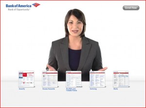
Following is a transcription of a chat session with Bank of America which outlines an attempt to have my fees reversed. Of course, I didn’t expect this to happen, though they did offer to refund $35 in fees.

What is most telling is how the customer service representative—both the front-line person and the specialist behind the lines—were not able to answer basic questions about the Clarity Statement, My Portfolio, the reason behind overcharge fees, the availibility of tutorials, how various screens on the site were interrelated, why certain monetary figures that could lead to overdraft charges appeared on different pages of the site, etc.

I have a hard time telling when I am speaking to an automated figure—the cut-and-paste element lends itself to that—or to a person. Especially annoying was when I was sent a link to a page I had already visited several times—or worse, to Janet!

This chat occurred on Tuesday, January 12, 2010, between the time of 5:45—7:20. I advise that all people filing complaints or attempting to appeal a charge do it through chat—and cut-and-page frequently during the chat—to have a record of your interactions with customer service.

I was going to keep the names of the representatives (which aren’t real, anyway) in this transcription, but changed my mind as I had told the guy, at the end, that I wouldn’t, and so am keeping my word.

Current Transcript of the Chat Session

Thank you for choosing Bank of America. You are now being connected to a Bank of America Online Banking Specialist.

E: Hello! Thank you for being a valued Bank of America customer! My name is E.

E: May I please have your complete name and last four digits of your account?

You: Brian Stefans—

You: ****

E: Thank you, Brian.

E: Welcome to Online Chat. How are you doing today?

You: Ok, but my account is -$277.

E: I understand your concern regarding the overdrawn account.

You: What can I do to reverse some of these charges. I don’t have enough cash to bring the account into a positive balance, which means I will start to accrue more penalties over the next week.

E: I do realize that you wish to refund some of the fees.

E: I will certainly check that for you right away.

E: Please give me a moment while I check the details for you.

You: Ok.

E: As you are our valued customer and do not want you to have bad experience with us as your satisfaction is of high priority for me!

E: I am able to refund you with fee of $35.00.

E: Please do trust me as I need to go beyond my limitations to get this refund for you.

E: Would you like me to process this for you?

You: That really won’t help much. Why do you need to go beyond your limitations? What are your limitations? [endnote 35]

E: I would like to let you know that we will be able to refund the fees only if it is a bank error.

E: As it is not a bank error, we are unable to refund fees.

You: This is my story. I am a teacher with a research fund, but the way that it works is that I purchase things with my own cash and get reimbursed about a week later. However, because of the holiday, they didn’t process my purchases, and after the holidays ended, they had a backlog which held the check up further. Meanwhile, I have a roommate (actually, my sister) who has been out of work for several months. For some reason unemployment decided not to send her a check this month (she has an appointment to speak with them on the 13th). But this would have all been fine except that a check I paid through Bill Pay—I pay everything through Bill Pay—wasn’t presented until two weeks later.

E: Please give me a moment while I go through the message.

You: I would have been fine—I had $70 dollars in the bank through the weekend until the reimbursement came in—but the check was presented and as a result I got 4 overdraft fees on the same day, and then another 2 the next day, all for things that were very inexpensive. Because I knew I didn’t have money, I bought a lot of small things instead of just getting a large number of things, hoping that would keep me afloat. I checked the website obsessively to be sure that I was within a safe range—something like 3-4 times a day—but I still got stuck with this.

You: I could have borrowed money once I learned the reimbursement would be late, but of course, it was pointless after I got in the hole. I have since borrowed some cash, but only so that I could buy groceries. I can’t even put it in the bank.

E: I completely understand your concern in this regard.

You: Of course.

E: But, I am sorry I am unable to refund all the fees for you.

E: I am able to refund only $35.00.

E: Trust me, this is the best that I can do for you at this moment.

You: Well then what happens? I can’t pay the balance. I’ve been a customer with your bank for nearly 15 years.

E: I really appreciate your relationship with us.

E: That is the reason, I am going ahead and providing with the $35.00 refund.

You: My credit rating is perfect—doesn’t this count for anything?

You: I teach computer interface and design, and I’m really very good with computers. Is there any place on the website where I can find good tutorials about the site? I made this mistake because I didn’t know where to look for checks that hadn’t been presented. It doesn’t appear on the Accounts Detail page.

E: I really wish I could but the credit rating will not come in count.

E: I personally apologize for the inconvenience caused to you.

You: I had a problem a few months ago because I didn’t know that holds appeared on the Available Balance History page and not the Accounts Detail page.

E: Would you like me to refund $35.00?

You: Yes, but could you at least help me with the site?

You: I don’t have any place to turn.

E: May I know which site you are referring to?

You: The Bank of America Online Banking Center.

E: Sure.

E: Online Banking [endnote 36]

E: Please click on the above link to know more about the online banking.

E: Is there anything else that I may assist you right now?

You: Yes, can you tell me what the Clarity Statement is? I came upon it recently.

You: I’ve seen the page you linked to, but it doesn’t explain the difference between the Accounts Detail page and the Available Balance History page, which I need to know.

E: Okay. I will let you know about the difference between both of them.

E: Please keep the following information in mind when reviewing your account balances.

You: Sure [endnote 37].

E: The first balance you notice is the available balance on the Accounts Overview screen.

E: This balance can be updated during a business day with normal electronic or branch transactions.

E: The available balance is the same information that appears on your ATM balance inquiry receipt.

E: Your available balance will also be displayed on the Bill Pay Overview screen in the Pay From drop-down box located on each payee.

E: A running balance for each item processed and the end-of-day ledger balance is shown on Account Activity sub-tab, on the Account Details page.

E: The ledger balance is all cash, checks and other items deposited to your account, minus all withdrawals and checks paid against the account.

E: The ledger balance does not include any transactions outstanding that have not yet been presented to the bank.

E: The ledger balance shown is current as of the previous business day.

E: Please note that the Account Details page will show both your available balance and your ledger balance.

E: The available balance is located on the top left of the screen.

E: The ledger balance is shown on the Account Activity sub-tab.

You: Ok. But how come holds don’t appear there?

You: If I can get penalized for holds, they should appear there, right?

E: When you make the debit card transactions it will show in pending status.

E: You need to make a note of the authorization holds.

You: Yes, but holds are a different matter. And you never know how much you are being held for.

You: Restaurants and bars don’t tell you this.

E: But you will know the amount that you spend right?

You: Yes, but that’s not what they hold you for. They often hold you for much more until they process the transaction. Meanwhile, you are held responsible for it by the bank.

You: And, again, that figure doesn’t appear in the Available Balance.

E: Typically, a transaction made with a check card or ATM Card using a PIN is processed and posted to your account on the same day that the transaction is made, or on the next business day.

E: When a check card transaction is made, the merchant requests the bank to authorize the transaction. If the bank does authorize the transaction, the bank becomes obligated to pay that amount to the merchant.

E: Usually, a transaction made with a check card will appear as authorized on the day it is conducted, but may take one to three business days to post.

You: So are you saying I should write down every transaction that I make?

E: Yes, you need to just make a note of it.

You: Everything, bottles of coke, hamburgers, etc?

E: Then it would be easier for you to use the funds.

E: Or.

E: You can set up for the alerts.

E: So whenever you make the transactions, you will receive the notice.

E: So that you cannot overdraw your account.

You: Yes, but the alerts only tell you when your balance reaches a certain point. I check the website all the time.

You: I won’t get an alert about a hold.

You: The alerts are linked to your available balance, which doesn’t account for holds.

E: I do realize your situation.

E: I will be glad to forward this suggestion to our respective department.

E: They will surely able to look in to this.

You: Also, I don’t understand why checks that have been paid through online Bill Pay, but which haven’t been presented, don’t appear as “pending” in Available Balance. Why is this?

You: If you pay all of your bills through site, as I do, and which BoA encourages, you would think that they would help you keep track of the ones that haven’t come in. I pay 15 bills through bill pay on average, which makes it hard to see what has already come in.

You: I.e. been presented.

You: How do I keep track of that?

You: Still there?

E: Yes.

E: I understand that you wish to keep all the track for all the bill payments, am I correct?

You: Yes, including those which don’t get presented right away. I was told by customer service that checks were sent out early so that they would be presented on the pay-by date, but this doesn’t seem to be true.

E: Online banking allows you to view the payments made last 180 days.

You: Yes, but where do I find information about checks that have been sent or “processed” but not presented?

E: You mean cancelled checks?

You: No, those checks that I paid through Bill Pay but which have not been deducted from my account.

You: Checks that I’ve sent appear in the left column on the day they are sent, then disappear. Most of them are deducted right away, but occasionally one is not deducted for a few weeks. They are hard to keep track of, and I can’t find anywhere on the site that just lets me know what they are.

E: Unless the bill payment posts to your account, you can view the cancelled bill pay.

E: Is there anything else that I may assist you right now?

You: Yes, can you tell me what the Clarity Statement is?

You: I really appreciate your help. I just don’t know where else to get this info from.

You: I figure with chat you can look these things up.

E: May I know from where you come to know about the Clarity Statement?

You: From the website, trying to find answers to these questions.

E: Please be rest assured that there is no such statement.

You: Ok. Sorry for all the questions. Could you explain to me the Extended Fees? When do they start, and how much are they?

E: Sure.

E: Extended overdrawn balance fees is the charge of $35.00 will be assessed to your account, if your account was overdrawn and if there was no deposit for the next 5 business days, then your account will be charged with Extended overdrawn balance fees [endnote 38].

You: How often?

E: Whenever the account was overdrawn.

You: No, I mean how often will I be charged an additional $35?

You: I don’t think I can pay back the bank within the week, or maybe even two weeks.

You: Is there a webpage that explains this?

E: Only one time.

You: Oh, so I’ll get an additional charge of $35 despite all of the overdrafts just once?

You: Sorry to pester you, but I’m in a bad situation.

E: Fees [endnote 39].

E: Please click on the above link.

You: Thanks, I’ll check.

E: You will get the details on all the fees.

E: Is there anything else that I may assist you right now?

You: Ok, a few more questions. What about My Portfolio. Would that help me?

You: Do holds, pending checks, etc. appear there?

You: Really sorry. I just need to know.

E: Not a problem [endnote 40].

E: My Portfolio gives you the ability to consolidate and manage all of your online accounts in one place, with a single ID and Passcode.

E: It provides a comprehensive view of all your accounts and balances across multiple financial institutions, and even allows you to consolidate non-financial accounts, such as frequent flyer programs and e-mail accounts.

E: No enrollment needed.

E: While signed into Online Banking, just click My Portfolio tab located on the Accounts tab.

E: Remember to always look for your SiteKey before you sign-in to Online Banking.

E: Bank of America accounts linked to your Online ID will be immediately available.

E: You can choose to add more accounts at any time.

E: To set up more accounts in My Portfolio, you will need your sign-in information, including user names and passwords, for each of the online accounts you want to view.

You: But what about holds and pending check?

E: I am sorry the authorization holds you cannot view it online [endnote 41].

E: However, if it is a deposit hold you will be able to get the details of the hold when ever you deposit the funds at the teller.

You: Ok. Thanks. One thing I discovered was the “Info Center.” What is that?

E: Info center is the one where you will get more information with pictorial representation.

You: Will it answer these questions?

E: You can just go through it, you will get more information.

E: However, if it is with regards to the fees, you can go through the link which I provided as Fees.

You: Ok, thanks. One last question. Can you tell me why exactly BoA charges overdraft fees? Is it a punishment, or is there some cost to the bank?

You: Where do these fees go?

E: An Overdraft item occurs when we pay your check or other transaction even though you do not have enough available funds in your account to cover the given transaction. In this case, we pay the transaction and charge you an Overdraft Item fee for each item.

You: So I buy something for one dollar and I get an overcharge fee for $35. I don’t quite understand.

You: But I know that’s what happens.

You: Lastly, who can I write to for more information about this? Or to appeal. Do you have an email address or phone number?

E: Yes, I do realize your situation.

E: Please let me know if you have any more queries, I will be glad to assist you?

You: I’d like an email address for someone else I can write to.

You: Or mailing address.

E: I request you to send us an e-mail by clicking on customer service tab then after that on left hand side there is a option send us a mail.

You: Yes, but that will just go to people like you who can’t do much because of your limitations. Is there anyone else?

E: Here me and my supervisor.

E: If you wish I can transfer this chat to him.

E: May I?

You: Sure, but show him this stuff so I don’t have to repeat myself.

You: Have a nice day, sorry to be a pain.

E: The chat will be encrypted.

E: You need not repeat the whole thing.

E: No worries!

You: Oh, ok.

E: Please give me a moment while I transfer this chat.

You: Sure.

You: You take care!

E: Thank you. You too.

Please wait while I transfer the chat to A. who can best assist you today.

Thank you for choosing Bank of America. You are now being connected to a Bank of America Online Banking Specialist.

A: Hello, I am A., the floor supervisor.

A: Please give me a moment while I go through the previous conversation.

You: Great, thanks!

A: Thank you.

A: Thank you for your patience.

You: Cool, no problem.

A: I understand that you are concerned about the overdraft fees.

A: Is that correct?

You: Yes. As you can see, I’ve asked several questions: about the difference between the Available Balance History and the Account Activity page, about where checks that have been paid through Bill Pay that have not been presented, about the Clarity Statement and its purpose, about the lack of really good tutorials on the site (the Info Center tutorials are really bad), etc.

You: I really want to know how to use this site, because I’ve had overdraft problems in the past, and they’ve mostly been for very different reasons: holds, checks, trying to change the amount of a bill pay and not being able to, etc.

You: Also about My Portfolio—can this help me put this all together?

A: Brian, I have reviewed your account and I see that the fees have been assessed correctly.

You: Yes, I know. I want information about the website.

A: However, I will be able to refund only one $35.00 fee as a courtesy.

A: Sure, please go ahead.

You: With what?

A: I understand that you would like to know about our Online Banking. Is that correct?

You: Yes, of course. Do you know what the Clarity Statement is?

A: Can you be more specific about the clarity statement?

You: You should probably Google it. It’s there. I think it was released in September.

You: It has a line about how all Bank of American customers should record ALL of their transactions in a check register. I discovered it when I was trying to find out why I was having all of these problems. I check the online center obsessively.

A: I would request you to contact us at 1.800.622.8731[Customer Service number for Checking and Savings] regarding the clarity statement.

You: What number is that?

A: The associates at the above mentioned number will help you with information about the clarity statement.

A: Our specialists are available between 7:00 a.m. and 10:00 p.m. Monday through Friday; 8:00 a.m. and 5:00 p.m. Saturday, Pacific Time.

You: Is there anyone more senior that I can write to about this? I’d like to write a formal letter to someone higher up in the company.

You: Here’s the Clarity Statement: https://www1.bankofamerica.com/deposits/odao/popup/disclosure_popup.cfm?template=sofCA&RequestTimeout=300

You: Here’s a story about it:

You: http://www.creditnet.com/credit-news/boa-offers-clarity-statement-for-credit-cards-19489771.php

You: Still there?

You: Sorry to be a pain.

A: Yes I am with you.

A: Brian, could you also let me know how I may help you with your concerns regarding My Portfolio?

You: I just want to know if it’s a place where all of my holds, pending checks and other data that seems spread out across your site can be found. But I’m more interested in the Clarity Statement, since it seems to have some purpose.

A: Let me explain My Portfolio.

You: Ok.

You: But only if it can help me in this situation.

You: I’ve cancelled all of my credit cards. I’m a web designer so I know about these things. But I get fouled up with this site in a hundred different ways.

A: My Portfolio is a feature that allows you to view your accounts with different financial institutions at one place [endnote 42].

You: I don’t deal with other financial institutions.

A: Okay.

You: Well, I guess I have all of the answers I need. You don’t know anything about the Clarity Statement, you can’t answer questions about the different screens on the site and where I can find detailed answers about them, you’ve never heard of the “Info Center,” you won’t provide me with a name or email address where I can lodge a complaint (this appears readily on the web), you can’t explain the logic behind overdraft fees, you haven’t referred me to any of the FAQs on the site (which are really poorly constructed), and you are not able to provide a customer of over 15 years with more than a $35 refund. Fine. This is all going into my report.

A: I will help you with the information about the various screens.

A: Please give me a moment.

You: No, too late. The site is really incredibly complicated, and if a person has to conduct a chat session for an hour and a half—a web designer and computer programmer, no less—then I’m not sure what you can do! Sorry to be a pain, but I’ve just written a thirty page analysis of your site which I will distribute to journalists, activist sites, etc. and this chat session (I won’t include your name) will be in it.

A: I personally apologize for any inconvenience caused to you in this regard.

You: Sounds good. Have a great night.

Note:
This post is a section of Bank of America Online Banking: A Critical Evaluation. This essay is also available as a book which can be downloaded for free at Lulu (where an inexpensive, not-priced-for-profit print edition can also be purchased) and at Scribd. The table of contents for the blog version of this essay can be seen in its entirety here.