Mon 18 Jan 2010
Appendix I: Screen Captures and Other Images
Posted by bstefans under Bank of America: A Critical EvaluationNo Comments
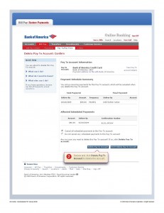
Following are several images illustrating the points above. I’ve chosen not to include helpful arrows or highlights to give the viewer a sense of how the information is organized graphically.
These were all captured on a weekend in which several overdraft fees were visible in my account, and yet when the damaging check had not been fully processed—a rare occurrence for highlighting these contradictions in the site before the “smoke settled†and they entirely disappeared.
Click to enlarge
________________________________________
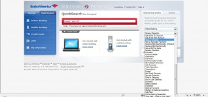
InfoCenter Page with dropdown (only half of the list of subjects is visible)—all of the information from these PDFs could have fit on a page:
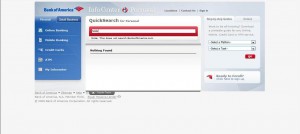
InfoCenter Page with “hold†as search item:
InfoCenter page with “overdraft†as search item—I couldn’t even complete word:

 
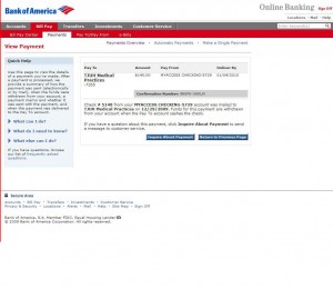
Payment Detail for check that has been presented:
Payment Detail for check that has not been presented—the difference of a few words in tiny print:
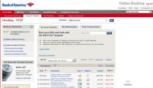
Checking Account Details with Available Balance History Link—note balance figure:
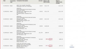
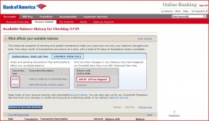
Available Balance History (header excluded)—very different presentation, different balance figure:
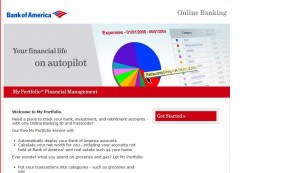
My Portfolio prior to joining—“Your financial life on autopilot,†in huge emphatic letters encouraging you to be less vigilant:
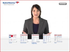
“Janet†the Flash lady in the InfoCenter—she starts talking as soon as the webpage loads:

 
“Janet†answering pseudo questions in a very highly-designed interactive Flash app. I was sent to this page by a customer service representative to get more details on my questions:
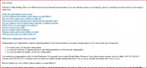
Format of the “Top 10 FAQs†page with rudimentary graphics and navigation:
 
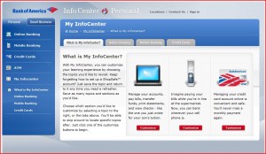
My InfoCenter—like all “my†style websites suggesting you can limit a huge wealth of information to a personal, easily referenced page—but, in fact, you have about 40 pages of info to collect:
Here’s another Flash lady I discovered late in the completion of this report. You can find her on Google by searching “Bank of America Online Banking,†and clicking on “Online Banking User Guide.†She doesn’t give her name. As you can imagine, this is anything but a guide:
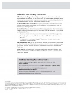
First page of the Clarity Statement—“We encourage you to record all of your transactions in a check register.†This would include, one imagines, every can of coke, pack of gum, etc:
The second page of “Clarity Statement†states that you cannot be charged more than 4 times a day. Of course, you can be charged another 4 times the next day—a cosmetic update:
Understanding Fees page with “Clarity Statement†link at the bottom. Tellingly, in the chat session that is transcribed below, the customer service represented, upon being petitioned, wrote: “I can assure you there is no such statement.†It’s buried so deep in the site that even the employees of don’t know about it. The website designer doesn’t, either—it is listed as providing “more detailed information about the account,†when it’s purpose was the opposite. Note the lack of glosses on any of this link—the user has no idea where he/she is going:

 
Search results for “My Portfolioâ€â€”largely further promotions of the product:
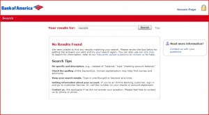
Search results for “cascadeâ€â€”a word that many users of Bank of America Online Banking know, but which is not a part of the BoA lexicon:
Tiny search box on standard BoA online banking page—much smaller type, no clear endorsement like “become all-knowing,†crowded out by competing graphics:
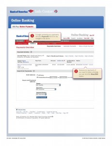
The “Review Payments†tutorial from the InfoCenter—no mention made of the variations in amount of time before checks are presented:
Second page of tutorial—note how speech box for the “save changes†button informs you that you should use it to “save changesâ€:
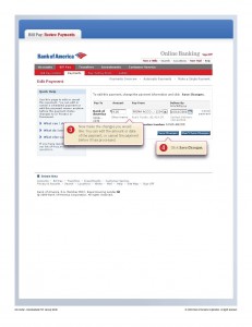
 
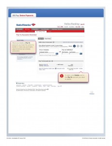
Page three of the “Review Payments†tutorial. We’re back at number one with no transition. We’re told to click the “delete†button to “delete†a payee:  
Page four of the tutorial—one final piece of redundant information:
The new Bank of America Online Banking software for mobile phones—this isn’t software? iPhone users can get this through the iStore:
 

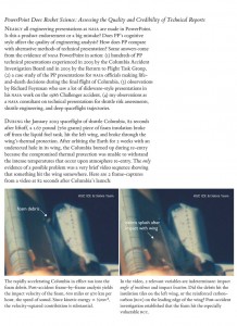
Page from Edward Tufte’s The Cognitive Style of Powerpoint outlining some of his arguments about the Space Shuttle disaster in 1986. [endnote 32]
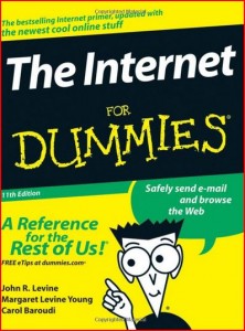
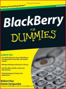
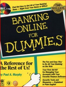
Images of books that provide detailed information on much simpler software. Why has there been no book on Online Banking published since 1999?
Note:
This post is a section of Bank of America Online Banking: A Critical Evaluation. This essay is also available as a book which can be downloaded for free at Lulu (where an inexpensive, not-priced-for-profit print edition can also be purchased) and at Scribd. The table of contents for the blog version of this essay can be seen in its entirety here.
